When writing a screenplay, it’s natural for us to focus on the plot, characters, dialogue and formatting. But when it comes to sending our scripts out into the wider world, the title page is usually the last point that’s considered.
It wouldn’t be strange to wonder whether a title page actually makes a difference in how our scripts are received, especially with the vastness of Hollywood today and the sheer number of screenwriters trying to make their mark. But does it really matter?
From formatting to content, today we’re deep diving into the world of screenplay title pages.
Let’s get started!
Table of Contents
- Script Title Page: An Introduction
- When It’s Safe to Break the Rules
- Pros and Cons: To Conform or Stand Out?
- Adding Personality to Your Title Page (Without Breaking the Bank)
- Real Examples of Unique Title Pages
- Final Verdict: Should You Take the Risk?
Script Title Page: An Introduction
The title page of our screenplay is the first thing a producer, agent, script readers and executives see when they open our scripts for the first time. The first impression, whether conscious or unconscious, sets the tone for how your script is perceived even before they turn to page one.
Think of your title page as a movie poster for your script when an audience sees it for the first time. From a professional standpoint, it signals to the reader whether the writer understands industry standards. They have become accustomed to certain conventions, with scripts coming across their desks constantly.
Not only does a title page show if you understand industry standards, but also shows if you respect the process of writing and the business of the film industry. A standardized title page tells the reader that you know what you’re doing and are playing by the rules, setting a strong precedent for any further communication you may have with the reader and beyond.
On formatting:
So what exactly does a “standardized title page” look like?
- Script title centered in upper case text.
- Writer’s name below the script title.
- Contact information or agency details on the bottom.
- Courier 12-point font.
- No images.
If you have access to screenwriting software (which you should!), the formatting for the title page will already be laid out for you, so it’s a case of filling in the blanks.
Our integrated title page in Celtx is ideal if you’re not sure how to format.
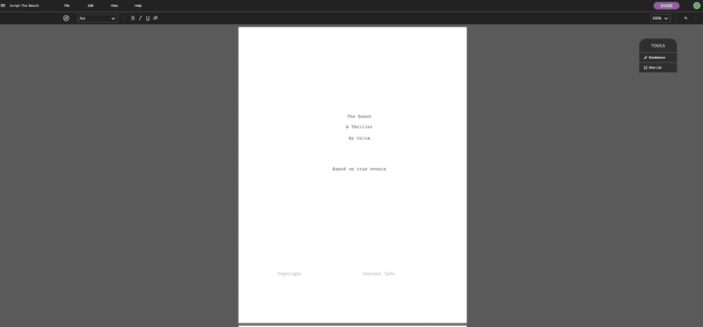
Examples of standard title pages:
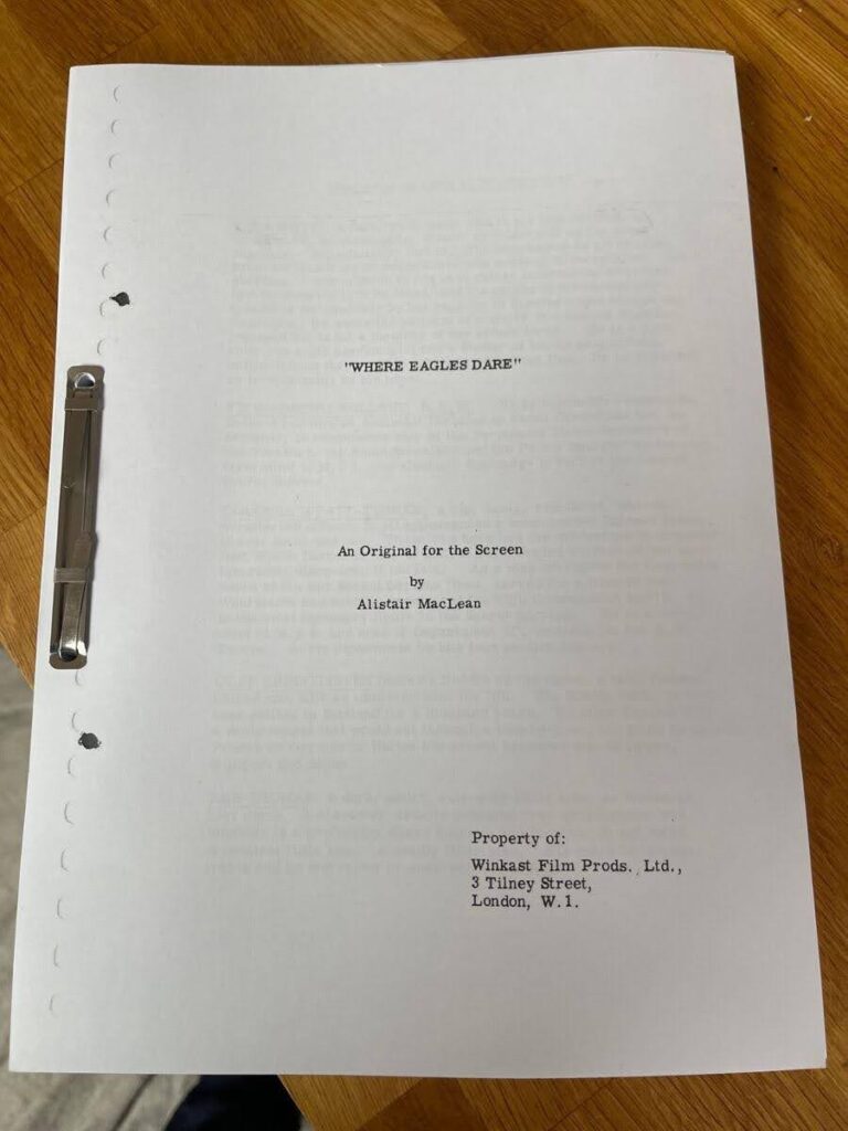
You may notice that the main section of the title page is slightly off-center. This is a traditional screenplay convention. When a script is printed, it’s then bound with a wide margin on the left-hand side. Once the printing and binding is complete, the main section is then central.
Take a look at this example below.
For an in-depth look at how to format your title page, check out our dedicated blog How to Format Your Screenplay Title Page [5 Easy Steps].
When It’s Safe to Break the Rules
Now that we’ve established how important title pages are to a first impression, what about those rare instances where you may want to push the boat out? At its core, screenwriting is a creative pursuit, and some may argue that the same creativity that’s gone into writing the script itself should be reflected on the title page too.
Breaking the rules, especially when it comes to screenwriting, is a risk. Some readers may love the extra pizzazz on the page, while others may throw the script out even before opening it.
However, there are subtle changes you can make to your title page to help you stand out without straying too far off what could be considered acceptable. For example, choosing a slightly different, but readable font for your script title can hint at the tone of your script.
Let’s look at a few examples:
Title Page: Poor Things (2023)
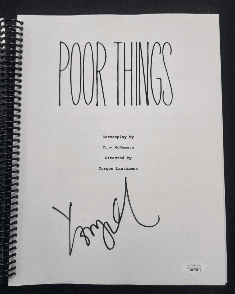
You’ll notice that the typography of the title matches the movie poster, tying the marketing together. This is something you can do to grab a reader’s attention. Notice that all the text underneath citing the writer and director continues in 12-point Courier font. This shows professionalism and awareness of the rules, while making a creative choice for the good of the overall movie.
If you decide to change the font, make sure it’s readable and that it hints at the tone of your screenplay. For example, if you’re writing a comedy, a playful sans-serif font could work, and a sleek, modern font for a sci-fi thriller could give the reader a glimpse into what to expect. Avoid multiple colors and stick to one or two, ensuring they’re not too garish that they’ll put a reader off completely! A minimal accent color should do the trick.
Formatting your title page is easy with Celtx. Try it today!
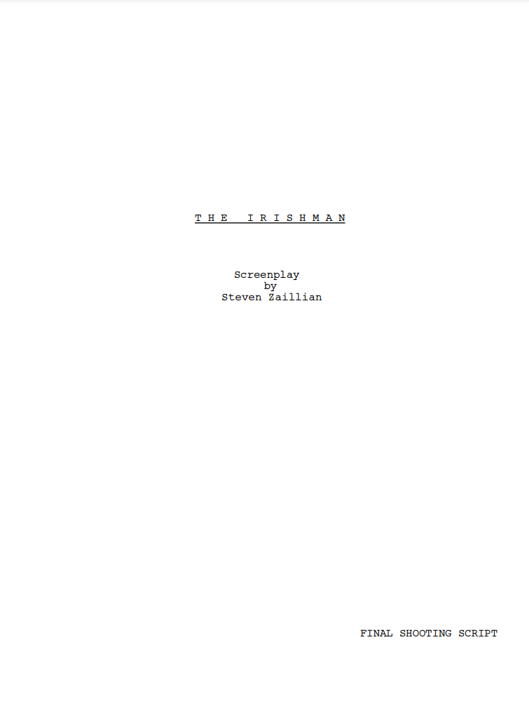
Title Page: The Irishman (2019)
If you’d prefer not to change the font, then how about adding extra space between the letters in the movie’s title? While it keeps the same font and style, the title stands out more:
Most screenwriting software will also allow you to add images into your screenplays, and that includes the title page. Again, whether you decide to include one or not is completely under your discretion. If it serves a purpose for the story itself, then by all means, add it. If you add an image just for the sake of it, it probably shouldn’t be there.
What is the best screenwriting software for you? The Write Stuff: Choosing the Best Screenwriting Software for Your Needs can help you decide.
Pros and Cons: To Conform or Stand Out?
Like many creative decisions we make as screenwriters, choosing whether to stick to a traditional title page or take a risk comes with its own set of pros and cons. Let’s explore the pros and cons of a traditional title page and an unconventional one.
Pros of traditional title pages
1. Instantly signals professionalism and industry knowledge
As we’ve previously mentioned, a standard title page tells readers that you’re familiar with industry norms and respect the submissions process, whether it’s for a competition or an opportunity to sell your script.
A reader can focus on the story, rather than be distracted by your design choices.
For specifics on all industry norms and expectations, the Writers’ Guild of America has a wonderful resource: The Screenwriters Handbook with everything you need to know!
2. Avoids distracting or turning off script readers accustomed to standard formats
Readers are used to reviewing dozens of screenplays in a day. More often than not, title pages will all conform to the traditional title page, and being one of the majority means a reader will most likely get into the flow of your script quickly without having to adjust.
3. Easier for competitions or submissions that explicitly request standardized formatting
Many screenplay competitions and production companies explicitly request standardized formatting. By sticking to the conventional title page, you reduce the risk of your script being rejected.
TOP TIP: Read submission requirements carefully for every competition you enter and production company you submit your script to.
Cons of traditional title pages
1. You risk blending in with thousands of other scripts
We’ve discussed how a traditional title page can show your professionalism, but it could also cause your movie to be just another script in a long stack of submissions. It can be harder for your script to stand out in the crowd.
2. Missed opportunity to give a hint of creativity before they even start reading
As we know, the title page is the first impression a reader has of your script. A traditional one may mean a missed opportunity to offer a small preview of your creativity and writer voice, differentiating yourself from the others in the pile.
Pros of breaking the rules:
1. Helps the script stand out immediately in a crowded space
In a sea of standard submissions, a unique title page is sure to catch a reader’s eye, especially when they’ve been running down a to-be-read pile of identical looking scripts. A break in traditional formatting can generate excitement with a subtle design element or thoughtful typography that makes the script sing before it’s even opened.
2. Shows creativity and willingness to take risks, which could reflect on the unique tone of the script
Taking small risks with the title page can demonstrate your boldness and creativity, indicating that the story within is imaginative and unique.
Cons of breaking the rules:
1. Could distract or annoy readers who expect traditional formats
If you’re a writer who is constantly changing things up on the title page, you can run the risk of alienating readers who expect industry-standard formatting. An overly busy title page could give the impression that you’re unfamiliar with screenwriting conventions, even if that’s not the case.
2. In some formal settings, non-traditional pages may be rejected outright
Returning to our earlier top tip, it’s important to be mindful of specific submission guidelines and rules that dictate competitions and formal submissions to agents, managers and producers.
If your title page deviates too much, you could miss out on an amazing opportunity to further your career, or to advance your script within the industry.
Related Reading: How to Professionally Structure Your Script || Celtx Blog
Adding Personality to Your Title Page (Without Breaking the Bank)
The good news is, you don’t have to go all out to add some personality to your title page. Minimal color accents associated with the tone of your story, for example, a faint gray accent to evoke the moody atmosphere of your film noir thriller.
As we’ve seen, typography changes can also introduce some flair. However, readability should always be your first priority. If a reader doesn’t know what the name of your movie is, because they can’t make out the title, it doesn’t set you off on the best foot.
Real Examples of Unique Title Pages
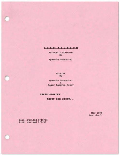
Pulp Fiction (1994)
Quentin Tarantino added just the right amount of flair on his title page for Pulp Fiction. While it sticks to the traditional conventions, the bold, blocky typography instantly matches the film’s edgy style.
Notice, Tarantino also added a tag line at the bottom “Three stories… about one story…”, again giving the reader an insight into not just the tone, but the structure too. Of course, if you decide to replicate this on your own title page, make sure it’s for the right reasons.
The Lego Movie (2014)
As a dynamic and colorful family movie, it was natural for the title page of The Lego Movie to play with the format. The bold, blocky text reflects the nature of the famous Lego brick, signaling the fun that’s about to be had.
While the title has been formatted differently, the remaining details on the title page remain to industry standard, showcasing the writers’ professionalism and knowledge.
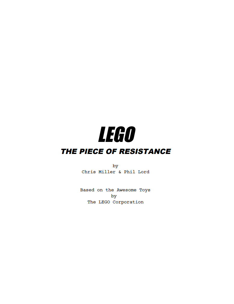
The balance of changing some elements of the design of the title page, while keeping some of the conventions in-tact, is a great way to showcase your creativity and professionalism!
Don’t just take it from us: Why Spec Scripts Fail: Screenwriting Format || Scriptmag.com
Final Verdict: Should You Take The Risk?
So, should you play it safe with a traditional title page or let your creativity shine? The answer depends on the project and your goals. If you’re submitting to a major competition or pitching to a traditional producer, it’s probably best to stick to the standard format. A professional title page shows that you respect the norms and allows the reader to focus entirely on your story.
On the other hand, if you’re submitting to a smaller production company, an indie producer, or working on a project that thrives on breaking conventions, it might be worth exploring a creative title page that reflects the unique tone of your script. Just remember, your priority is always the story. The title page should enhance your script—not distract from it.
Leave the formatting to us. Create your script’s title page with Celtx today.
Up Next:

How to Format Your Screenplay Title Page [5 Easy Steps]
Thinking about making your title page stand out? First, make sure you’ve nailed the basics. Learn how to format your screenplay title page the right way.
