Picture this: after months of tireless effort, your screenplay is finally complete. Every character arc, plot twist, and line of dialogue has been meticulously crafted.
But there’s one element that often gets overlooked, and it’s the first thing anyone will see – your screenplay’s title page.
A well-formatted screenplay title page is like a clean front door – it’s the first impression that invites the reader inside your story world. Neglecting it can mean the difference between a script that gets read and one that gets tossed aside.
So, let’s dive into the specifics of making your script title page shine. Follow along as I guide you through five easy steps to ensure your title page stands out in the pile and, more importantly, gets your screenplay the attention it deserves.
Table of Contents
- The Anatomy of a Professional Title Page
- Step-by-Step Guide to Formatting Your Title Page
- Best Practices for Your Title Page
- Celtx: The Easiest Way to Create a Professional Title Page
- Examples and Visual References
- FAQs
- Conclusion
The Anatomy of a Professional Title Page
A professional screenplay title page is a minimalist document. Its purpose is to present crucial information in a clean, uncluttered, and professional manner. Here are the core elements you’ll include:
Title and author: The cornerstone of your title page. Your screenplay’s title and your name must be correctly positioned and formatted to set the tone for what’s to come.
Contact details: You never know when your screenplay will strike a chord with a producer, director, or production company. Having your contact information readily available facilitates potential connections and opportunities that may come your way. I find that using an app to organize project and contact details can be incredibly helpful.

Credits: This includes any co-writers, as well as an “Adaptation” or “Story by” credit if your script is based on existing material. Crediting your collaborators and source material is not just a professional norm—it’s a legal necessity.
Adaptation or story by credit: If you’re standing on the shoulders of other creators, acknowledging their work is not just a nice gesture – it’s a legal necessity. Paying respect to the original author’s work validates their creativity and intellectual property.
Copyright symbol and WGA Number: Inserting a copyright symbol and/or WGA registration number are optional. Some writers feel they serve as a clear reminder of your legal rights, while others feel they are unnecessary to list on the page. Your rights don’t change if they’re not shown. It’s your call.
Images and fonts: When it comes to the title page, going the minimalist route pays off. Opting for standard fonts and steering clear of images help maintain a professional and focused atmosphere. After all, your screenplay should do the talking, not the bells and whistles on your title page.
Step-by-Step Guide to Formatting Your Title Page
A properly formatted title page adheres to strict industry standards. Following these steps ensures your script looks the part from the very first page.
- Get Your Format Right
The foundation of a professional title page is standard screenplay format.
Use a 12-point Courier font and set your margins to 1 inch on all sides. These are non-negotiable industry standards, and sticking to them shows that you understand the rules of the game. - Place Your Core Information
Each element of your title page has a specific place. Start by positioning your actual title in the center of the page, both vertically and horizontally. Just below your title, still centered, insert “by” or “Written by” followed by your name on a new line.
- Handle Credits Correctly
If your screenplay is a collaborative effort, proper credit attribution is essential.
– “&” vs. “and”: This is a crucial distinction. An ampersand (&) between writer names (e.g., John Smith & Fred Jones) means they wrote the script together as a team. The word “and” means they worked on it at different times.
– Adaptation Credits: If your screenplay is an adaptation of an existing work or is based on a story by another author, it’s essential to give proper credit. This acknowledgment should be placed directly beneath your title and your name, again centrally aligned. You would typically use the format “Based on the [novel/play/article/etc.] by [Author’s Name]” or “Story by [Author’s Name].” - Position Your Contact Information
Your contact details should be aligned to the bottom-left corner of the page. An email address and phone number are sufficient, but if you have an agent or manager, it’s best to include their contact info instead.
Double-check everything—a simple typo can mean the difference between a call from a potential producer and a missed opportunity. - Add a WGA or Copyright Notice (Optional)
While your screenplay is automatically copyrighted the moment you write it, including a WGA registration number or copyright notice is a good practice. This information is typically placed in the bottom-right corner of the title page. You would write “© [Year] [Your Name]” for a copyright notice.
Need a visual guide? Here’s our video that will walk you through the process!
Best Practices for Your Title Page
Go Minimalist:
Avoid images, unique fonts, or any design elements that don’t serve a clear purpose. Your title page should be clean, uncluttered, and professional. The minimalist route always pays off.
Avoid Unnecessary Information:
Keep your title page concise by omitting unnecessary information like the draft number, draft dates, loglines, or rewrite information. For a spec script, less is always more.
Use industry-standard formatting tools and software
Using industry-standard screenwriting software tools ensures your screenplay will conform to the accepted norms of the film industry. Celtx offers a fantastic software option for screenwriters.
Proofread, Proofread, Proofread
A simple spelling mistake on your title page is a glaring red flag. Read your title page out loud to catch any errors and confirm every piece of information is correct.
Celtx: The Easiest Way to Create a Professional Title Page
Following these steps manually can be a tedious and stressful process. One missed space, one wrong margin, or one typo can undermine the professional impression you’re trying to create. That’s why using industry-standard software is the first rule of professional screenwriting.
Celtx removes all the guesswork from the process. Our platform automates the entire formatting workflow, including your title page. Instead of manually adjusting margins and font, you simply fill in dedicated fields for your title, name, and contact information. The software handles all the spacing, capitalization, and placement for you, guaranteeing a perfectly formatted title page every single time. It’s the easiest way to make sure your script is ready for any size screen.
Examples and Visual References
Now that we’ve covered the groundwork, let’s see some real-world examples of well-formatted title pages from acclaimed films. Seeing these elements in action will offer a practical understanding of how they weave together to form a coherent title page.
Inglorious Basterds (by Quentin Tarantino):
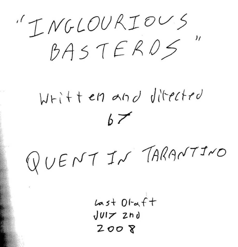
Here’s what’s wrong with this one:
- The title and the author’s name are haphazardly placed.
- The font is handwritten and tough to read.
- The title page is a photocopy of a handwritten page.
- It’s distracting and can turn off potential readers before they even get to the actual script.
Let’s face it, if this was written by anyone other than Quentin Tarantino, it would be a flashing neon sign saying, “Stop Here!”
But as you can see, there are exceptions to every rule, and they’re mostly by established or famous writers. Bottom line – once you’re famous, you can break the rules too – but until then, you need to play by the rules like everyone else.
The Social Network (by Aaron Sorkin):
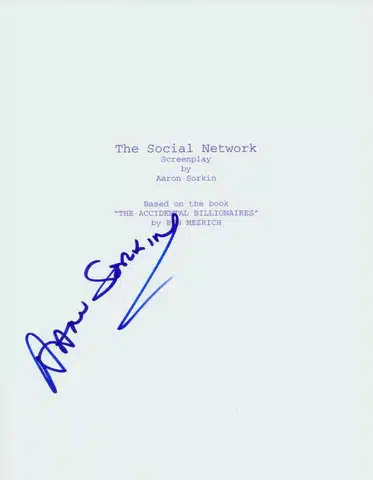
This title page is a masterclass in clean, professional formatting. It’s minimalist, easy to read, and clearly lays out all the essential information without any distractions. This is the gold standard for a spec script.
Pulp Fiction (by Quentin Tarantino & Roger Avary):
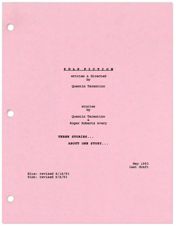
This one is a great example of a collaboration credit using the ampersand. It visually shows that the two writers worked together as a team, which is important for understanding the creative process behind the film.
FAQs
While a logline is crucial for pitching, it is not standard practice to include it on your title page. It’s better to save it for your query letter or an oral pitch.
No. Courier 12-point is the industry standard for a reason. It is universally accepted and helps readers accurately gauge your script’s length and pacing. Using a different font can make your script look unprofessional.
No. While including a copyright symbol is a good practice, it doesn’t replace official copyright registration with the U.S. Copyright Office or WGA registration. These are the steps that provide legal protection for your intellectual property.
Conclusion
All in all, having a properly formatted title page is vital for a script. It should be as professional as possible and contain all the necessary information in the correct places. Make sure to use proper screenwriting software like Celtx (it’s free to sign up!), as it will help you get the key elements of your written script formatted properly.
So get out there, write your screenplay, and make sure your screenplay title page format is on point!
Remember, it’s the first thing anyone sees, so make it a good one. You’ll feel so much better knowing that your movie ideas are packaged up in a professional-looking screenplay.
Good luck!
Up Next:
Does Your Script’s Title Page Really Matter?
Formatting is the first step — but how much weight does a title page really carry? Find out why your script’s title page can make (or break) a first impression.